Stakeholders (C-level) asked us to enhance JogjaKita, but there was no user-centered data available. Utilizing survey user interview, usability testing techniques, we investigated users' needs, pain points, and discovered the behaviors of JogjaKita's users. We identified two personas with distinct behaviors and backgrounds. Some findings were transformed into insights related to complaints, covering UI/UX, marketing, JogjaKita's partners (merchants and drivers), and so on. These insights can later serve as a reference for JogjaKita's improvement.
BACKGROUND
JogjaKita is a ride-hailing app exclusively serving Jogja. Despite operating for nearly two years, its focus has been primarily on business development, with the user experience taking a backseat. The goal is to gain a deeper comprehension of users, their journey patterns, and collect insights to guide more effective actions.
RESEARCH OBJECTIVE
OBJECTIVE 2
Understanding the users
Understanding the behavior and user journey of JogjaKita’s users when using JogjaKita in daily life
OBJECTIVE 2
Know the user needs & pain points
Get feedback and user pain points while using JogjaKita’s service.
RESEARCH GOALS
GOAL 1
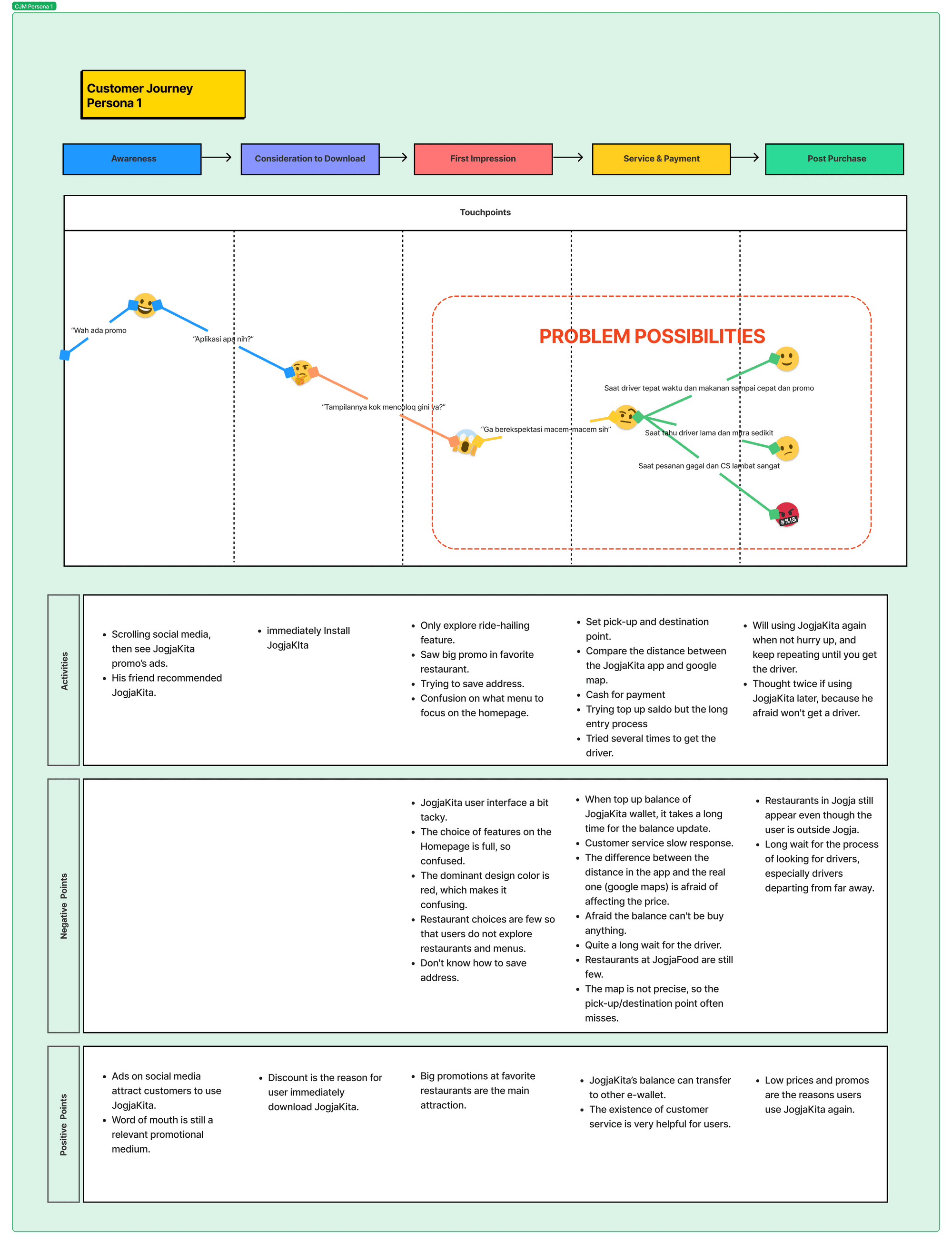
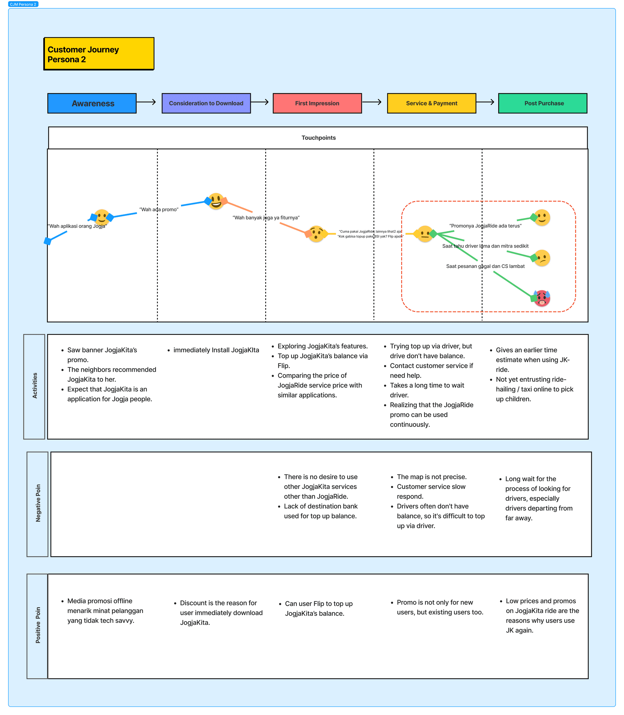
Personas & User Journey of users
Envision customer experiences and challenges through Personas and user journey mapping.
GOAL 2
Insight for actionable strategies
Offer an insightful statement for actionable strategies for the Jogjakita Team.
RESEARCH METHOD
Since we strive to understand user feedback, pain points, and problem areas, we conducted…
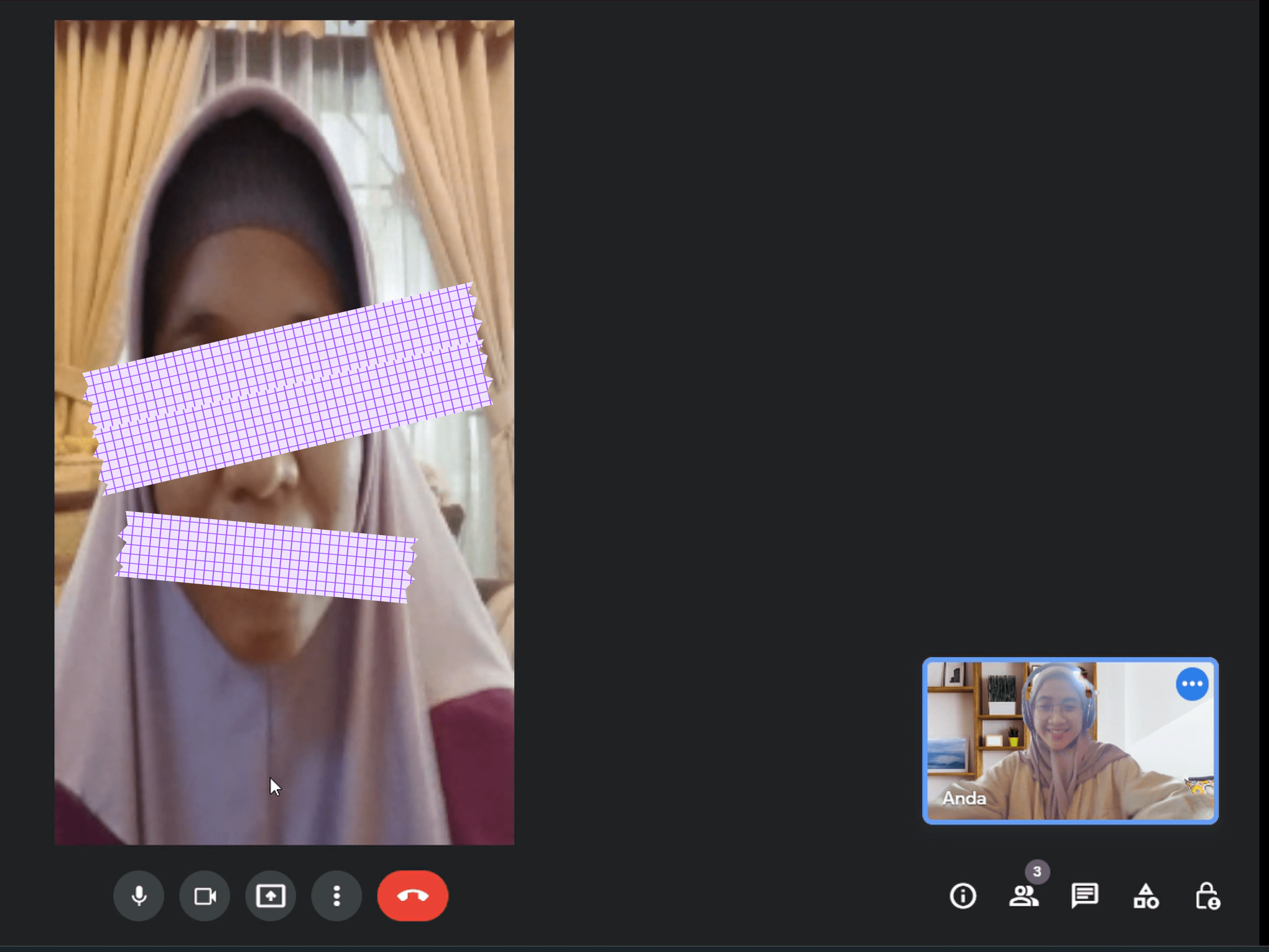
In-depth Interviews and usability testing existing app.
Just so you know, this research is an ongoing process stemming from survey analysis. Information from user interviews, user satisfaction & NPS, along with brief feedback, has been gathered during the survey phase.
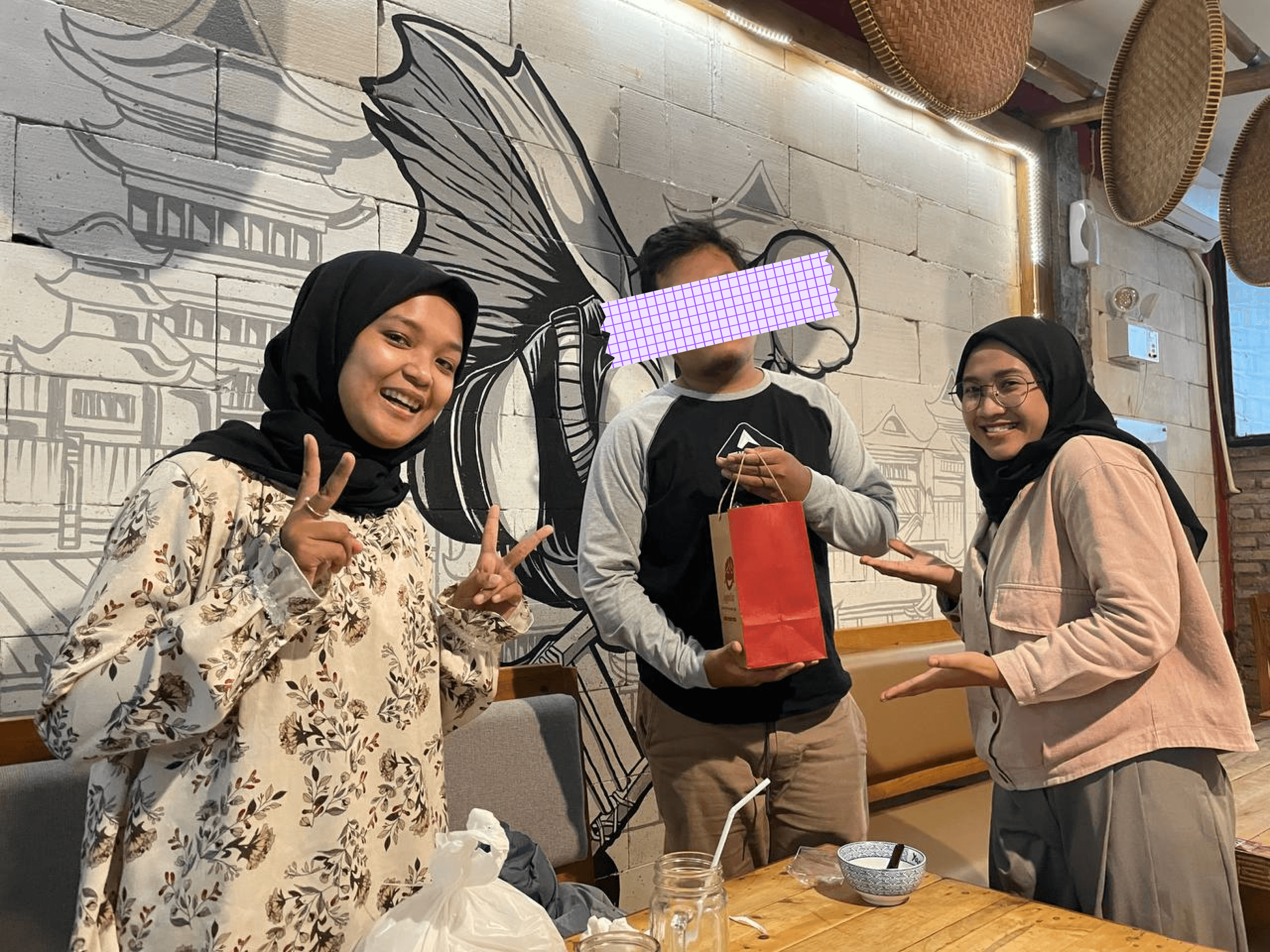
RECRUITING PARTICIPANTS
Male and Female
Age 20 - 50 years old
Use JogjaKita or have used JogjaKita
Participant over 30 years old who took part in online interviews couldn't perform short usability testing due to challenges in screen sharing (user lacking tech skills) so we didn't carry out usability testing with the current app to understand user behaviors and pain points when using JogjaKita, from opening the app to placing an order.

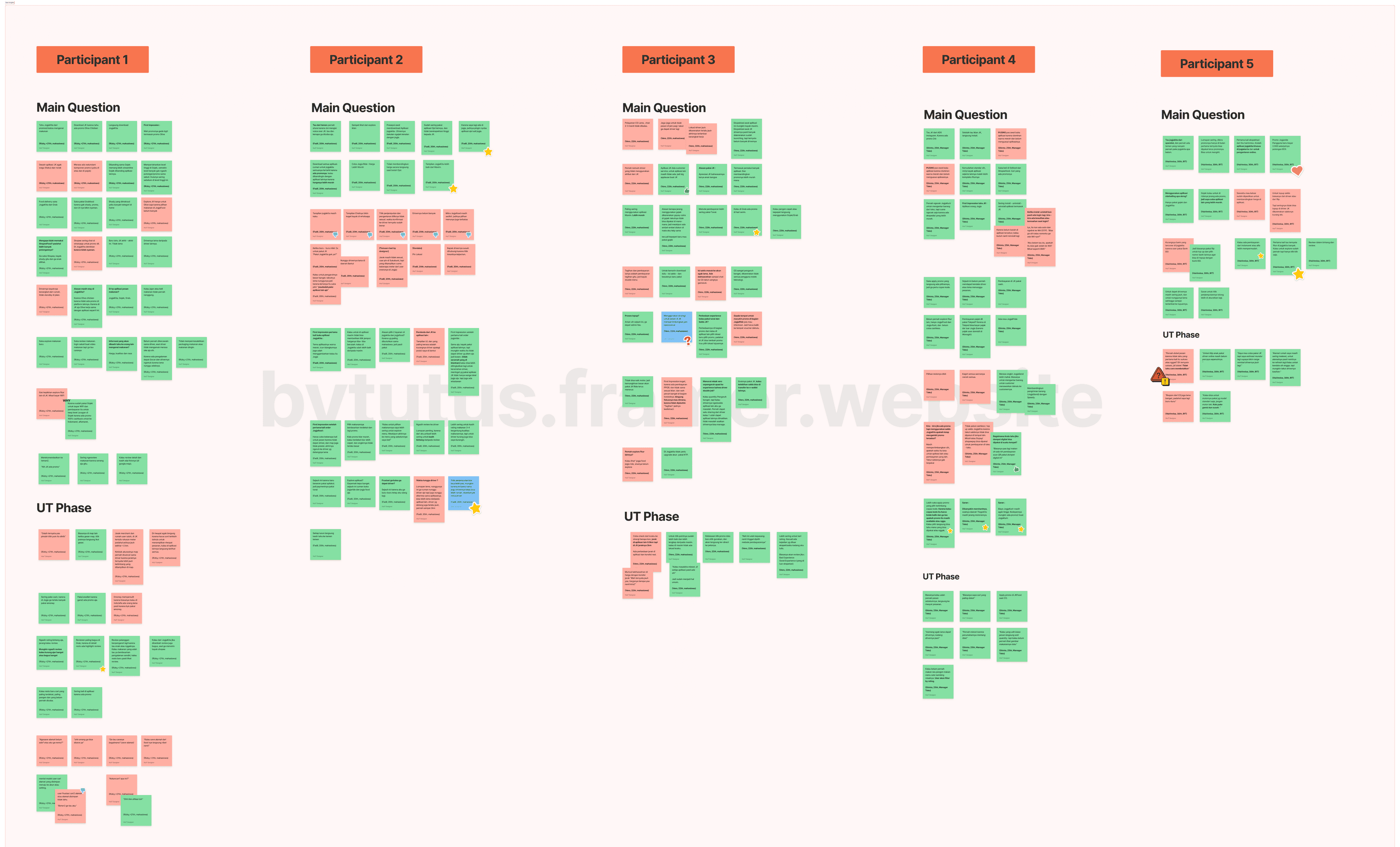
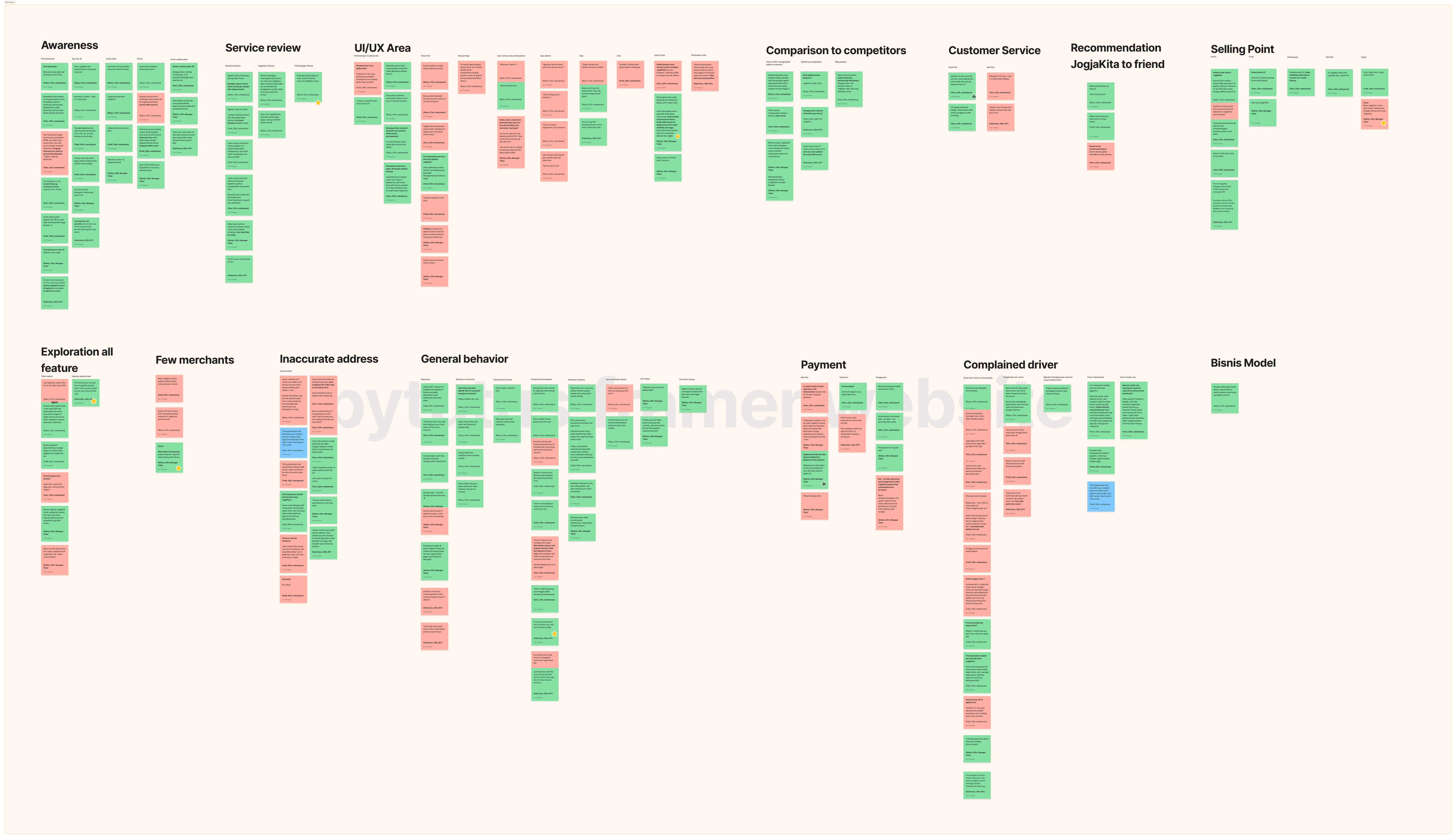
Process raw data, then categorized into an affinity diagram
My team and I synthesize the findings from interview data and small-scale usability tests of users into an affinity diagram. Some of the grouped information we gathered was participant demographics, user demands daily ride-hailing, participant cognizance upon JogjaKita discovery, feedback on utilizing JogjaKita services, and challenges faced while using JogjaKita. Note, I did not show up all data here such as user demographics because of privacy.
Together to understand the users
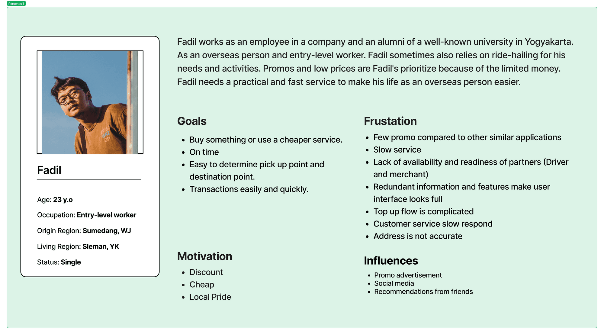
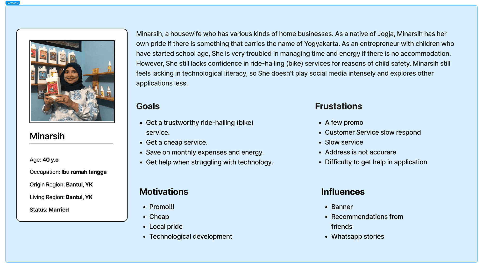
A. Persona
Insight Statement
Insight #1: Drivers' reliability decreases when rushed.
The lack of drivers makes customers have to longer wait times and often struggle to find driver. So, customer to avoid using JogjaKita in urgent situations or when in a hurry.
Insight #2: The limited of merchants restricts customers' ability to explore and order food on JogjaFood
Customer don't explore food options in JogjaFood due to the limited merchant and distant locations of merchants, resulting in a lack of interest and fear of high shipping costs. So, customers lack of interest to buy and fear of high shipping costs.
Insight #3: The accuracy of maps within JogjaKita needs improvement.
The accuracy of maps within JogjaKita needs improvement. Customes are uncertain about shipping costs because the displayed distances often don't match those on other applications or Google Maps. So, customers find it difficult to determine pick-up and drop-off points.
Insight #4: Initial user impression of the app was considered poor
The user interface is rigid and predominantly red, making it less comfortable and causing users to struggle in focusing on their goals. Persona 1 users experience confusion on the homepage due to redundant information, so customers are challenging to prioritize or choose among different components.
Recommendation
Insight #1 through insight #3 have been provided to the related team (marketing, developer, etc) for decision-making or issue resolution. So that, my team and I focused on offering recommendations in the UI/UX area :
Enhanced Homepage by considering user experience that felt overwhelmed, cluttered, and unfocused. So that:
Minimize red hue/color in the interface and banners.
Organize PPOB service.
Refresh icons to better reflect functionalities and a modern feel.
Enhance the homepage by reducing redundant information, allowing users to easily focus and prioritize information. So that:
The PPOB functionality isn't required in the nav bar; instead, a category element is established on the Home page.
A single shortcut to the promo/voucher page .
Improve the JogjaRide, JogjaKurir, JogjaCar checkout pages, considering the inconsistencies in how to apply promos for each service, thus make different expectations for users. Also, address the user experience issue of navigating between the promo and checkout pages. So that:
Implemented the option to input promo/voucher codes at the checkout page.
Disable promo/voucher that are not applicable at the checkout stage, so users are aware of the unusable promos.
Continue to preserve the method for selecting a promo, which is by directly choosing from the available promo vouchers.


© Bariyatus Diyah Nurlaili 2024